
NY Times - we are in Global Normal
It seems like The Inconvenient Truth has obviated the need for me to continue beating my point about consensus not being what it is cracked up to be. The movie has created an opportunity for the silenced to be heard.
My argument about a lack of consensus is QED, at this point, so I will try to move on to new topic soon.
I have two more items to throw into the mix. The second entry will follow, as I can't figure out an HTML error in the mess. That entry addresses the movie directly. For example, the review of peer-reviewed journal articles missed 11,000 others because the professor screwed up her search terms and only found 980. In fact, there are only THIRTEEN ARTICLES that support the 'consensus thesis' that humans are the cause of global warming. That is in the next blog.
This entry, from a questionable soure, explains how High School level graph reading is a good thing for politicians and journalists to understand.
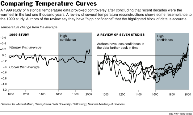
The New York Times published a piece on June 23, 2006, don't worry I didn't buy it, where there was a review of the material used by advocates of global warming. Specifically, a 1999 study by Michael E Mann, say, didn't he produce Miami Vice, whose study started talk of a hockey stick shaped graph line. See graphs, below.
In Dr. Mann's study, the last 600 years were 'cooler than normal' while the top of the hockey stick managed to break into the warmer-than-normal part of the graph. To repeat - the top of the stick is THE FIRST TIME IN 600 YEARS North America broke into the WARMER THAN USUAL area. Before judging, one has to know the baseline, but who cares, this is only basic science. High School graph reading is a required skill here, lest you go on in vain.

Anyway, the new review of seven studies, reported in the NYT, goes out of its way to clear Dr. Mann of intentionally skewing his data - they say it was a good first shot. The new review shows North America dove in 'cooler than normal' section of the graph since 1,000 AD and has rebounded lately. So for 1950 years we remained below the normal line - much farther below than Dr. Mann found, generally 3 times deeper. If you apply stock analysis techniques to the graphs, you can say the cold period bottomed out in 1610, with a confirmation in 181o. That's when North American warming got started.
The trend since about 1810 is up, per the hockey stick, and has only breached into warmer than normal in the last twenty years, according to two studies reviewed, as best I can sort out the bunched up graph. The other five have us still below, but real close. So, let us all scream in terror as North America borders on normal temperature.
You probably heard about this review on the TV news as saying the earth [wrong - its only North America] is at the hottest point in 1,000 years. Then, it was reported - 2,000 years [Associated Press' Headline.]
Yup, sort of true, but the hottest point in 2,000 years falls directly and 'inconveniently' at the normal line. Gotta love the free press, where else can you be biased without government direction....
If my philosophically left friends, incorrectly called 'liberals,' have ever wondered why spittle forms on the side of my mouth while they talk to me, it is caused by this sort of reporting in the left's Bible. The facts are revealed, generally, but are not clear to the casual reader. Studies show we generally read the headline and first paragraph for news. If you wish to find inconvenient facts, you needs to try page six, but don't miss a day. The information won't return.
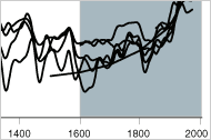
By the way, the graphs you see above from the NYT only appears if you click on the graph inserted into the online story. I stumbled on this as I was tring to find the graph in the hardcopy.

The graph that most people will see DOES NOT HAVE THE NORMAL LINE INCLUDED. This has to be done consciously. If you don't get the implication of this this, I can't help.
And you are the folks who ask me what my sources are.
My argument about a lack of consensus is QED, at this point, so I will try to move on to new topic soon.
I have two more items to throw into the mix. The second entry will follow, as I can't figure out an HTML error in the mess. That entry addresses the movie directly. For example, the review of peer-reviewed journal articles missed 11,000 others because the professor screwed up her search terms and only found 980. In fact, there are only THIRTEEN ARTICLES that support the 'consensus thesis' that humans are the cause of global warming. That is in the next blog.
This entry, from a questionable soure, explains how High School level graph reading is a good thing for politicians and journalists to understand.
The New York Times published a piece on June 23, 2006, don't worry I didn't buy it, where there was a review of the material used by advocates of global warming. Specifically, a 1999 study by Michael E Mann, say, didn't he produce Miami Vice, whose study started talk of a hockey stick shaped graph line. See graphs, below.
In Dr. Mann's study, the last 600 years were 'cooler than normal' while the top of the hockey stick managed to break into the warmer-than-normal part of the graph. To repeat - the top of the stick is THE FIRST TIME IN 600 YEARS North America broke into the WARMER THAN USUAL area. Before judging, one has to know the baseline, but who cares, this is only basic science. High School graph reading is a required skill here, lest you go on in vain.
Anyway, the new review of seven studies, reported in the NYT, goes out of its way to clear Dr. Mann of intentionally skewing his data - they say it was a good first shot. The new review shows North America dove in 'cooler than normal' section of the graph since 1,000 AD and has rebounded lately. So for 1950 years we remained below the normal line - much farther below than Dr. Mann found, generally 3 times deeper. If you apply stock analysis techniques to the graphs, you can say the cold period bottomed out in 1610, with a confirmation in 181o. That's when North American warming got started.
The trend since about 1810 is up, per the hockey stick, and has only breached into warmer than normal in the last twenty years, according to two studies reviewed, as best I can sort out the bunched up graph. The other five have us still below, but real close. So, let us all scream in terror as North America borders on normal temperature.
You probably heard about this review on the TV news as saying the earth [wrong - its only North America] is at the hottest point in 1,000 years. Then, it was reported - 2,000 years [Associated Press' Headline.]
Yup, sort of true, but the hottest point in 2,000 years falls directly and 'inconveniently' at the normal line. Gotta love the free press, where else can you be biased without government direction....
If my philosophically left friends, incorrectly called 'liberals,' have ever wondered why spittle forms on the side of my mouth while they talk to me, it is caused by this sort of reporting in the left's Bible. The facts are revealed, generally, but are not clear to the casual reader. Studies show we generally read the headline and first paragraph for news. If you wish to find inconvenient facts, you needs to try page six, but don't miss a day. The information won't return.
By the way, the graphs you see above from the NYT only appears if you click on the graph inserted into the online story. I stumbled on this as I was tring to find the graph in the hardcopy.
The graph that most people will see DOES NOT HAVE THE NORMAL LINE INCLUDED. This has to be done consciously. If you don't get the implication of this this, I can't help.
And you are the folks who ask me what my sources are.
Labels: Global warming
posted by Gene | 1:32 PM
![]()
![]()
0 Comments:
Post a Comment
Subscribe to Post Comments [Atom]
<< Home